Thursday, October 29, 2015
Professional Article Review
The article Creative Anarchy at its Very Best is simply saying that its okay to break the rules of design but in order to break the rules, you have to know the rules. The authors main claim is "Breaking design rules means testing the limits of your creativity, challenging your strengths and strengthening your weaknesses" (paragraph 11). The authors argument is basically the same thing as their main claim, trying to design out of your comfort zone. When the author said "The ability to push boundaries is a respected quality. It shows that you are willing to go beyond the expected by the demonstrating that you will invest time and creative strategy in a design concept" (paragraph 10) I think that they were trying to say that when you are creating something randomly that you do not ever really think about what you are making, it just comes to mind which is shown in the way your design turns out to look like. I am concluding this by understanding that it is okay to break the rules when you are creating a design, but you have to know when it is an appropriate to break the rules and when it is not appropriate to break the rules.

Tuesday, October 27, 2015
Shadow

Wednesday, September 2, 2015


Thursday, August 20, 2015
What is Graphic Design?

Graphic design is a language of living and is used in every single aspect of life. When you're making a design you want to use words and the image to say something. I judge a book by its cover but no matter what I think about the book, Im always going back to look at the cover. When making a design, do what you think is right first, then think about what other people are going to think. I personally look at pictures more than i look at text, because i am more interested in the picture rather than reading with whatever it has to say. Graphic design is looking at an image or a design and being able to look further into what you are looking at and actually understand the meaning behind it all.
Wednesday, May 20, 2015
Final e9 Post

Graphic Design
Our first rotation was in Graphic Design, in that class we came together as a group; MaKenna, Evan, Kaylee, Kris, and decided on what our product was even going to be. We decided on going with a shoe. I created the logo that represented our products name, Soler Shoe, and the colors; Red, Orange, and Yellow. I chose those colors because the product name Soler, represents the sun and how the shoe is solar powered, and the sun charges the shoe. When I was making the logo, I did it all free-handed. and while I was putting the gradient indie of the S, i also free-handedly drew in the flames that are inside of the S, that represents the flames coming off of the sun.


Everyone in the group helped out when we created the Ad and the coupons. Our group worked really good together. We all pitched in ideas that improved out product. I came up with the slogan "#1 on your feet and #1 on the street". Then right after that, Kaylee started to work on the Ad.
When we made the coupons, we decided to go with 25% off because you actually save a little more than 30 dollars.
Web


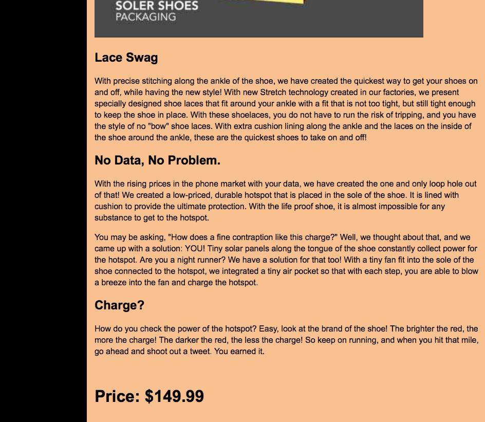
When we leaned houw to make a website, it was challenging at first but I soon got the hang of it. We created the website in Adobe DreamWeaver. To make a website there is a lot of steps that come along with it. and the coding portion of making a website can be also challenging. Evan created out website, which thats where you can find all of the information that you would like to know about our product.
Animation

In the animation rotation, there was a lot of stuff to learn about. When we created the typography for our product, we out a road in the middle because it goes along with our slogan of "#1 on the street and #1 on your feet"
Video
As a group we made a commercial that represented our whole invention. We learned a lot throughout the whole year when it comes to creating a movie and or a commercial. We had to make sure that we did not forget anything that we learned and anything about our product that we were going to put in our commercial.
The main idea of our commercial is, people trip and fall over their shoe laces and get tangled up in their earbuds. But with Soler Shoes, there are no shoe laces that make you trip and fall over on. When you put your foot into the shoe, the shoe adjust to your foot and makes your foot secure in the shoe so you will not gal over. There is also a built in hot stop that lets you use the internet anywhere you would like, and lets you stream music without using earbuds.
I have learned so much throughout the year in the E-Communication strand. I hope that i can use all of the information that i have learned and use it in my future. I am going to continue doing E-Comm next year where i hope i can improve and learn new skills that will make me a better student.
If i could do anything different this year it would be my presentation. As a group she we started the presentation, it went good but when it was my turn to speak i think i should have spoke up a little bit pounder when i talked so that more people could have been able to hear me.
By doing this project i have learned that without people and teammates, its hard to meet your goals and get done what needs to get done.
Monday, May 4, 2015
Commercial
Our company is Soler Shoes. In this rotation of our group
project, we as a group made a commercial to sell out product. For our invention, we made a shoe. This isn’t
any normal shoe. It has no laces so that you wont trip and fall on them. Our
slogan goes along with out shoes, number one on the street and number one of
your feet. They have a built in hot spot so you can listen to music anywhere
you would like. We created this video by working together as a team and staying
on task.
There were a few miss-haps such as the camera not reading
the card. But that never stopped us. We used a variety of shots to make out
commercial video come together.
We also used music to make our video stand out more. By working
in a group, it was a lot easier coming up with ideas because there is more
people that put in ideas.
Wednesday, February 25, 2015
Photoshop Projects
Project 2- Northwest

We were assigned to make many different photoshop projects in Graphic Design. When I was making the Northwest project 2, I thought that it was going to be easy when I first opened the guidelines. But when I got to the point where I had to make the mask, i got stuck. I has to ask many questions but when i got it, it was as simple as can be.
Project 1- Compass

We got a project to do in Graphic Design, we were assigned to make the ONW compass and the ONW letters in front of the Olathe Northwest building. This project relates to project 4 and project 2 because we were suppose to make makes of both of them.
Butterfly

We were assigned to turn a normal monarch butterfly into a colorful and vibrant looking monarch butterfly in Graphic Design. I used the Hue/Saturation tool to make the colors inside if the individual spots of the butterflies wings. To select a section of the wing, you just click on the spot but to select more than one section at a time, you click one spot and hold the shit key and select other sections.
Project 4- Collage

We were assigned to make a collage by using a picture of the Northwest building as the base. This project is very much alike to project 1 with the compass because they both have to have masks on them. Whats different about this project that we were given is that, we had to put multiple pictures in side of one and make them into a collage.
Subscribe to:
Posts (Atom)